
Mistakes Businesses Make When Designing A-Frame Signs (And How to Fix Them)
Written by eSigns Editorial Team • Published on April 9, 2026
At a Glance
- Most sidewalk A-frame signs fail because they're designed for up-close reading, not fast-moving foot traffic.
- Overcrowded layouts and vague messaging make signs easy to ignore even in high-traffic areas.
- Poor contrast, hard-to-read fonts, and glare can significantly reduce visibility outdoors.
- Many businesses forget that an A-frame is a directional and decision-making tool, not just a mini billboard.
- Small design adjustments can meaningfully improve clarity, foot traffic, and ROI without constantly reprinting.
A-frame signs do more than attract attention — they influence decisions on the street, often before someone chooses where to eat, drink, or stop. In that moment, your sign can either encourage action or be ignored completely.
And yet, some still walk past A-frame signs due to a few common design mistakes. Subtle issues such as overcrowded text, hard-to-read fonts, and unclear messaging can affect the sign's effectiveness and make it harder for people to understand the message you want to convey.
If you plan to display signs on your sidewalk, this eSigns guide breaks down the most common, fixable mistakes in A-frame sign design. We'll also show you how to make signs clear, intentional, and effective at stopping people and guiding them inside.
Common A-Frame Design Mistakes and How to Fix Them
Mistake #1: Trying to Say Too Much at Once
One of the most common A-frame mistakes is treating the sign like a flyer.
Cramming too much information, such as menus, hours, promotions, hashtags, and brand slogans, into a small frame only creates visual noise. From six or eight feet away (where most people first notice a sign), nothing stands out.
Sidewalk signs compete with:
- People walking quickly
- Cars, bikes, strollers
- Storefront clutter and street signage
- Weather, glare, and changing light
In this situation, more information doesn't necessarily mean more effectiveness.
Instead of overloading your design with information, focus on one primary idea:
- A specific daily special
- A time-bound offer ("Lunch until 2pm")
- A category decision ("Coffee / Breakfast Inside")
- A directional cue ("Enter Here")
If someone needs to stop and read for more than a couple of seconds to understand the message, it's likely doing too much.
Mistake #2: Designing for Standing Still Instead of Walking By
Many A-frame signs are clearly designed with the reader in mind, standing calmly in front of it.
In real life, most pedestrians are walking past at a slight angle, viewing the sign for less than 3 seconds, or processing the message from 5-15 feet away.
When businesses design for close-up reading, they often:
- Use font sizes that look fine up close but disappear at a distance
- Choose thin lettering that loses contrast outdoors
- Write full sentences instead of short phrases
- Rely on clever phrasing that requires a second read to "get it"
Remember to prioritize instant comprehension over cleverness.
That means:
- Large, simple typography
- Short phrases instead of full sentences
- High contrast between text and background
- Clear hierarchy (headline first, detail second)
A sign that can be understood while someone keeps walking is far more powerful than one that rewards those who stop.
Mistake #3: Letting Brand Personality Hurt Readability
Brand identity matters, but sidewalks are not the same as Instagram or menus. Your fonts, colors, and tone make your brand unique, but sometimes prioritizing style over visibility can do more harm than good.
Some examples include:
- Script fonts that look artisan but blur at a distance
- Low-contrast color palettes that fit the brand indoors but fade in sunlight
- All-lowercase messaging that feels modern but reduces scannability
Adapting to the environment is essential if you want your A-frame signs to be effective. Here's what you can do to simplify the brand expression:
- Choose one brand color instead of four
- Select one readable typeface instead of a full brand system
- Go for clear icons or symbols instead of decorative details
- Use strong contrast between text and background
Consistency builds trust, but clarity earns attention. Outdoors, clarity is more essential than branding.
Mistake #4: Forgetting the Sign's Real Purpose
Sometimes, A-frames are treated as general promo surfaces rather than decision-support tools.
But when someone encounters a sidewalk sign, they're often asking quick, practical questions:
- What is this place?
- Is it open right now?
- Is it relevant to me at this moment?
- Where do I go if I want in?
Effective sidewalk A-frames should give direction and support decisions.
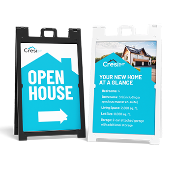
Examples of strong action cues includes:
- "Open Now"
- "Order Inside"
- "Patio Open"
- "Breakfast →"
- "Lunch Specials Today"
The more people are encouraged to act, the more likely they are to do so.
Mistake #5: Ignoring Lighting, Glare, and Weather Conditions
A-frame signs live outside, yet many designs don't fully account for that.
Some common issues include:
- Matte text on glossy backgrounds that reflect sunlight
- Dark colors that become unreadable at dusk
- Chalk-style designs that fade unevenly
- Laminated inserts that warp or buckle due to heat
These problems often develop slowly, making them easy to overlook. A sign that looked fine when it was installed may be quietly degrading week by week.
When designing or selecting an A-frame, assume that it will be viewed in full sun and shade, get wet at some point, or be seen under morning, noon, and evening light.
Designing with durability and outdoor readability in mind helps the message stay consistent even when conditions aren't perfect.
Mistake #6: Treating Both Sides the Same
Sidewalk traffic isn't symmetrical. People approach from different directions and at different speeds, with varying sightlines. However, some businesses repeat the same content on both sides on their A-frames, missing an opportunity to tailor their message and maximize visibility.
In practice, one side often faces oncoming foot traffic from down the block and gets longer viewing time, while the other side catches people already nearby and works better for confirmation or direction.
Using the same layout isn't wrong but deliberately considering how each side is encountered can improve performance.
For example:
- One side focuses on attraction ("Coffee & Pastries")
- The other reinforces action ("Order Inside")
Mistake #7: Never Updating or Refreshing the Design
A-frame signs often become invisible simply because they're outdated.
Regular passersby stop noticing static signage, especially in busy areas. A sign that's been in the same spot with the same message for months will eventually fade into the background.
This doesn't mean redesigning constantly, but it does suggest planning for flexibility. Here are examples of small updates you can do for your A-frame signs:
- Swappable inserts
- Seasonal messaging shifts
- Daypart-specific content (breakfast vs. lunch)
- Event-based updates
For restaurants and cafés, small changes signal life and relevance. They tell regulars that something is happening today, not just in general.
Practical Design Tips to Keep in Mind
Follow these tips if you want your A-frame signs to increase foot traffic:
- Design for distance first, detail second
- Focus on one clear takeaway, not many
- Prioritize readability over decoration outdoors
- Use the sign to reduce decision friction, not add to it
- Include at least one call to action
- Revisit your sign periodically and look at it like a first-time visitor
Conclusion
Most A-frame sign mistakes are gradual, understandable, and completely fixable. They're small design choices that reduce clarity in fast-moving environments. To avoid these mistakes, always design with clarity, focus, and surrounding conditions in mind.
If you're evaluating whether your current A-frame is pulling its weight or planning your next one, the team at eSigns.com can help ensure your design works not just on screen, but on the street.
FAQs
How much text should an outdoor A-frame sign have?
As little as possible while still being clear. One headline and one supporting line is often enough. If it feels crowded, it probably is.
Are images effective on A-frame signs?
Sometimes, but only if they're bold, simple, and readable at a distance. Busy photos or small graphics often add clutter rather than clarity.
How often should sidewalk A-frame signs be updated?
Even small changes every few weeks can help keep regular foot traffic engaged. Daily or weekly updates work well if the format allows.
Do chalkboard-style A-frames perform better?
They can feel approachable and flexible, but legibility and consistency matter. Smudged or uneven chalk can reduce impact over time.
Related Articles
Standard A-Frame Sign Sizes: How to Choose the Right One Without Overthinking It
Confused about A-frame sign sizes? This eSigns guide covers standard sizes, common uses, and which fit sidewalks, storefronts, and events.
Read More →
Are A-Frame Signs Allowed on Sidewalks? ADA Considerations for A-Frame Signs
Are A-frame signs ADA compliant? Learn simple sidewalk clearance, height, and placement rules to avoid fines and complaints
Read More →
Where to Put an A-Frame Sign: A Simple Placement Guide for Local Businesses
Wondering where to place your A-frame sign? This eSigns guide shares tips to boost visibility, foot traffic, and customer decisions.
Read More →Data Subject Rights
Privacy Request
You may have certain rights with respect to the personal information we collect and process. These rights vary by state and country and depend on your residency. These rights are not absolute and we reserve all of our rights available to us at law in this regard. Please complete the below form to exercise one of your data subject rights, where applicable. We will process your request within the time provided by applicable law.